


Everything fit together like pieces of a puzzle.
The core of the identity is the unifying grid, where artists and concerts fit together to create a visual patchwork connecting all the artists Luger represent while still leaving ample room for individual expression. It's a practical platform which allows for playful combinations and unexpected results.


The primary typeface, Druk, allow for high flexibility and visual contrast in typographic treatment.

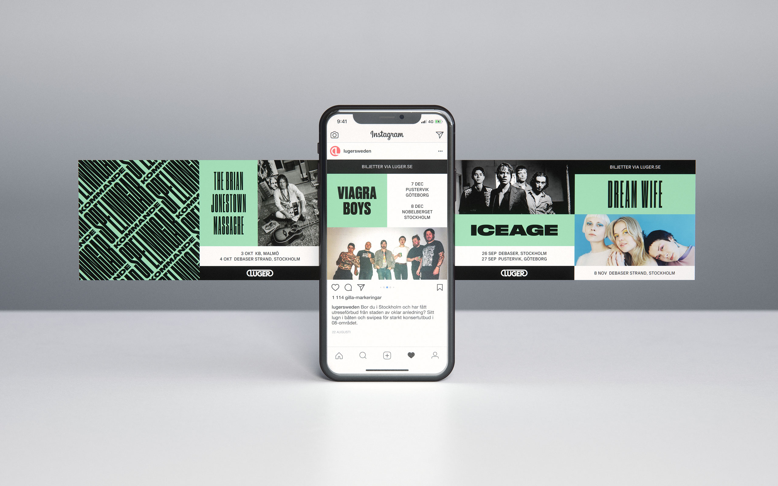


Social media is one of Lugers primary means of communication. We made sure to build that type of flow right in to the identity.

Luger is a well known brand in the industry, and their logotype has always been their most iconic visual asset. With that in mind the logotype was completely redrawn, while respecting the overall design of the original. It’s slightly thinner to give a lighter tone of voice. Evening out the spacing between the characters ensures the logo now works equally well in digital and print applications across a large range of sizes.


Motion is inherent to the Luger identity. Everything is made to be animated, and it adheres to a certain visual rythm.


A fitting symbol for one of the great hit makers of his time.
Denniz Pop was one of the great producers and songwriters of his time, igniting huge commercial phenomenons of the MTV era such as Britney Spears, Backstreet Boys and NSYNC.
We utilized the holy grail of the music industry at the time, the Golden Record, as a focal point of the logo and imagery to connect it to the legacy of Denniz Pop while also flaunting some heavy industry flex.


A sharp identity for a keen commercial property consultant
The use of sharp angles and crisp typography sets the tone of Frontage as a keen property consultant. Bla bla bla... The use of sharp angles and crisp typography sets the tone of Frontage as a keen property consultant. Bla bla bla...
A sharp identity for a keen commercial property consultant
The use of sharp angles and crisp typography sets the tone of Frontage as a keen property consultant. Bla bla bla... The use of sharp angles and crisp typography sets the tone of Frontage as a keen property consultant. Bla bla bla...


